All About Pai: Weather and Smoke
allaboutpai.comWeather and Smoke → Pai Overall Average

All About Pai: Weather and Smoke
allaboutpai.comWeather and Smoke → ค่าเฉลี่ยทั่วอำเภอปาย

Year by Year: Pai Overall Average

This is part of the Pai pollution monitoring page at https://allaboutpai.com/weather. Charts below update daily.

Contact: air@allaboutpai.com.

ปีต่อปี: ค่าเฉลี่ยทั่วอำเภอปาย

นี่เป็นส่วนหนึ่งของเพจติดตามตรวจสอบมลพิษปายที่ https://allaboutpai.com/weather แผนภูมิด้านล่างอัปเดตทุกวัน

ติดต่อ: air@allaboutpai.com

Pollution by Time of Day

มลพิษตามเวลาของวัน

Intro

This is a visualization of the US AQI pollution levels over all the years of data collection for the station named "Pai Overall Average."

We align each year by month so that you can compare seasonal pollution levels. The dim vertical lines are weeks of each month (7 day intervals).

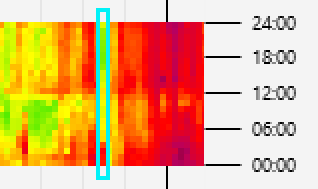
Within the colorful horizontal strip for a given year, each vertical column represents one day. Here is an example where we highlight one day with a blue box:

คำอธิบาย

นี่คือการแสดงภาพระดับมลพิษ US AQI ในช่วงหลายปีที่ผ่านมาของการรวบรวมข้อมูลสำหรับสถานีที่มีชื่อ "ค่าเฉลี่ยทั่วอำเภอปาย"

เราจัดเรียงข้อมูลในแต่ละปีเพื่อให้คุณสามารถเปรียบเทียบระดับมลพิษตามฤดูกาลได้ เส้นแนวตั้ง(สีเทาจาง) คือสัปดาห์ของแต่ละเดือน (ในช่วง 7 วัน)

ภายในแถบแนวนอนสีต่างๆ สำหรับปีที่กำหนด แต่ละคอลัมน์แนวตั้งแสดงถึงหนึ่งวัน นี่คือตัวอย่างที่เราเน้นหนึ่งวันด้วยกล่องไฮไลท์สีฟ้า

As you move up the column for that day from bottom to top, you move from early morning, through noon (12:00), to midnight. So the example day above had red pollution level until about 04:00 (4am), then went to yellow level until about 14:00 (2pm), then went to green level for most of the evening and night.

You can use this visualization to see what time of day pollution is typically better or worse.

Learn more about the AQI pollution scale and colors

Regions of the visualization that are gray color means that no data was collected at that time on that day.

เมื่อคุณเลื่อนคอลัมน์สำหรับวันนั้นๆ ขึ้นจากล่างขึ้นบน คุณจะเลื่อนตั้งแต่เช้าถึงเที่ยงวัน (12:00 น.) ไปจนถึงเที่ยงคืน ดังนั้นวันที่ยกตัวอย่างข้างต้นจึงมีระดับมลพิษสีแดงจนถึงเวลาประมาณ 04.00 น. จากนั้นไปที่ระดับสีเหลืองจนถึงเวลาประมาณ 14.00 น. จากนั้นไปที่ระดับสีเขียวเกือบทั้งช่วงเย็นและกลางคืน

คุณสามารถใช้การแสดงภาพนี้เพื่อดูว่ามลภาวะในช่วงเวลาใดของวันโดยทั่วไปดีขึ้นหรือแย่ลง

เรียนรู้เพิ่มเติมเกี่ยวกับระดับและสีของมลภาวะ AQI

ภูมิภาคของการแสดงภาพที่เป็นสีเทาหมายความว่าไม่มีการรวบรวมข้อมูลในขณะนั้นในวันนั้น

The color scale for Pollution (US AQI from PM2.5) looks like:

ระดับสีสำหรับมลพิษ (US AQI จาก PM2.5) ลักษณะดังนี้:

No
data
ไม่มี
ข้อมูล
Good ดี
0

1000
Hazardous
2000
Learn More
เรียนรู้เพิ่มเติม

Pai Overall Average – Pollution by Time of Day – allaboutpai.com
ค่าเฉลี่ยทั่วอำเภอปาย – มลพิษตามเวลาของวัน – allaboutpai.com
Janม.ค.Febก.พ.Marมี.ค.Aprเม.ย.Mayพ.ค.Junมิ.ย.Julก.ค.Augส.ค.Sepก.ย.Octต.ค.Novพ.ย.Decธ.ค.201900:0006:0012:0018:0024:00202000:0006:0012:0018:0024:00202100:0006:0012:0018:0024:00202200:0006:0012:0018:0024:00202300:0006:0012:0018:0024:00202400:0006:0012:0018:0024:00202500:0006:0012:0018:0024:00202600:0006:0012:0018:0024:00

Pollution by Level

มลพิษตามระดับ

Intro

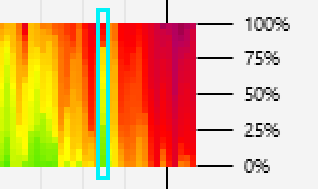
Here is a slightly different visualization that helps you get a sense of what percent of each day has different levels of pollution (rather than what time of day).

To help you see this, we sort the pollution levels seen on each day from the cleanest levels (bottom) to the dirtiest levels (top):

คำอธิบาย

ต่อไปนี้เป็นการแสดงภาพที่แตกต่างกันเล็กน้อยซึ่งจะช่วยให้คุณทราบว่าเปอร์เซ็นต์ในแต่ละวัน ว่ามีระดับมลพิษต่างกันเท่าใด (แทนที่จะเป็นช่วงเวลาใดของวัน)

เพื่อช่วยให้คุณเห็นสิ่งนี้ เราได้จัดเรียงระดับมลภาวะที่พบในแต่ละวันจากระดับที่ ค่า PM2.5 น้อยที่สุด (ด้านล่าง) ไปจนถึงระดับที่ค่า PM2.5 มากที่สุด (บนสุด):

In the example day highlighted in blue above,

This visualization was inspired by the yearly charts from aqicn.org, which show three levels per day (quartile 1-3, aka 25%, 50%, 75%) diagonally in each square. Here we have expanded on that idea by showing up to 24 levels per day and displaying in a vertical format that makes it easier to see day-to-day patterns. And we have made the visualization more useful by merging together years of data from 25+ Pai stations into the Pai Overall Average virtual station.

If you incorporate, or are inspired by, this visualization idea in your website or app, please give credit and link to: https://allaboutpai.com/weather/. Thank you.

ในวันที่ยกตัวอย่างที่เน้นด้วยกล่องไฮไลท์สีฟ้าด้านบน

การแสดงภาพนี้ได้รับแรงบันดาลใจจากแผนภูมิรายปีจาก aqicn.org ซึ่งแสดงสามระดับต่อวัน (ควอร์ไทล์ 1-3 หรือที่รู้จักในชื่อ 25%, 50%, 75%) ในแนวทแยงในแต่ละตาราง ที่นี่เราได้ขยายแนวคิดดังกล่าวด้วยการแสดงมากถึง 24 ระดับต่อวัน และการแสดงในรูปแบบแนวตั้งที่ทำให้ง่ายต่อการดูรูปแบบในแต่ละวันได้ง่ายขึ้น และเราได้ทำ การสร้างภาพข้อมูลที่จะมีประโยชน์มากขึ้นโดยการรวมข้อมูลหลายปีจากสถานีปายมากกว่า 25 แห่งเข้ากับสถานี "ค่าเฉลี่ยทั่วอำเภอปาย".

ถ้าคุณจะเอารูปแบบกราฟหรือการดีไซน์กราฟหรือการแสดงผลโดยกราฟ จากเวปไซค์แห่งนี้ เพื่อเอาไปใช้ในเว็บไซต์หรือแอพพิเคชั่นอื่นๆ โปรดให้เครดิตและลิงก์ไปที่: https://allaboutpai.com/weather/ ขอบคุณครับ

The color scale for Pollution (US AQI from PM2.5) looks like:

ระดับสีสำหรับมลพิษ (US AQI จาก PM2.5) ลักษณะดังนี้:

No
data
ไม่มี
ข้อมูล
Good ดี
0

1000
Hazardous
2000
Learn More
เรียนรู้เพิ่มเติม

Pai Overall Average – Pollution by Level – allaboutpai.com
ค่าเฉลี่ยทั่วอำเภอปาย – มลพิษตามระดับ – allaboutpai.com
Janม.ค.Febก.พ.Marมี.ค.Aprเม.ย.Mayพ.ค.Junมิ.ย.Julก.ค.Augส.ค.Sepก.ย.Octต.ค.Novพ.ย.Decธ.ค.20190%25%50%75%100%20200%25%50%75%100%20210%25%50%75%100%20220%25%50%75%100%20230%25%50%75%100%20240%25%50%75%100%20250%25%50%75%100%20260%25%50%75%100%

All Fields by Time of Day

ทุกๆป้อนตามเวลาของวัน

Intro

This is a visualization of Pollution, Rain, Wind Speed and Temperature over all the years of data collection for the station named "Pai Overall Average."

Like the first pollution chart above, each column represents one day and goes from early morning (bottom) to noon (middle) to late night (top).

คำอธิบาย

นี่คือการแสดงภาพระดับ มลพิษ ฝน ความเร็วลม และ อุณหภูมิ ในช่วงหลายปีที่ผ่านมาของการรวบรวมข้อมูลสำหรับสถานีที่มีชื่อ "ค่าเฉลี่ยทั่วอำเภอปาย"

เช่นเดียวกับแผนภูมิมลพิษแรกด้านบน แต่ละคอลัมน์แสดงถึงหนึ่งวันและเริ่มจากเช้าตรู่ (ล่าง) ถึงเที่ยง (กลาง) ถึงดึก (บน)

The color scale for Pollution (US AQI from PM2.5) looks like:

ระดับสีสำหรับมลพิษ (US AQI จาก PM2.5) ลักษณะดังนี้:

No
data
ไม่มี
ข้อมูล
Good ดี
0

1000
Hazardous
2000
Learn More
เรียนรู้เพิ่มเติม

The color scale for Rain (mm/hr) looks like:

ระดับสีสำหรับฝน (มิลลิเมตร/ชั่วโมง) ลักษณะดังนี้:

No
data
ไม่มี
ข้อมูล
No
rain
ไม่มี
ฝน
0.4mm6.2mm12mm

The color scale for Wind Speed (meters/sec) looks like:

ระดับสีสำหรับความเร็วลม (เมตร/วินาที) ลักษณะดังนี้:

No
data
ไม่มี
ข้อมูล
No
wind
ไม่มี
ลม
0.04m/s2.52m/s5m/s

The color scale for Temperature (Celsius) looks like:

ระดับสีสำหรับอุณหภูมิ (เซลเซียส) ลักษณะดังนี้:

No
data
ไม่มี
ข้อมูล
0°C25°C50°C

Note: rain and wind data comes from the "Wiang Nuea: Vimarnkiri Resort Rain and Wind" station, which might not be near the place where pollution and temperature data were measured.

ข้อมูลฝนและลมมาจากสถานี "ฝนและลม วิมานคีรี รีสอร์ท เวียงเหนือ" ซึ่งอาจไม่ได้อยู่ใกล้สถานที่ตรวจวัดข้อมูลมลพิษและอุณหภูมิ

Pai Overall Average – All Fields by Time of Day – allaboutpai.com
ค่าเฉลี่ยทั่วอำเภอปาย – ทุกๆป้อนตามเวลาของวัน – allaboutpai.com
Janม.ค.Febก.พ.Marมี.ค.Aprเม.ย.Mayพ.ค.Junมิ.ย.Julก.ค.Augส.ค.Sepก.ย.Octต.ค.Novพ.ย.Decธ.ค.2019Pollutionมลพิษ00:0006:0012:0018:0024:002019Rainฝน00:0006:0012:0018:0024:002019Wind Speedความเร็วลม00:0006:0012:0018:0024:002019Temperatureอุณหภูมิ00:0006:0012:0018:0024:002020Pollutionมลพิษ00:0006:0012:0018:0024:002020Rainฝน00:0006:0012:0018:0024:002020Wind Speedความเร็วลม00:0006:0012:0018:0024:002020Temperatureอุณหภูมิ00:0006:0012:0018:0024:002021Pollutionมลพิษ00:0006:0012:0018:0024:002021Rainฝน00:0006:0012:0018:0024:002021Wind Speedความเร็วลม00:0006:0012:0018:0024:002021Temperatureอุณหภูมิ00:0006:0012:0018:0024:002022Pollutionมลพิษ00:0006:0012:0018:0024:002022Rainฝน00:0006:0012:0018:0024:002022Wind Speedความเร็วลม00:0006:0012:0018:0024:002022Temperatureอุณหภูมิ00:0006:0012:0018:0024:002023Pollutionมลพิษ00:0006:0012:0018:0024:002023Rainฝน00:0006:0012:0018:0024:002023Wind Speedความเร็วลม00:0006:0012:0018:0024:002023Temperatureอุณหภูมิ00:0006:0012:0018:0024:002024Pollutionมลพิษ00:0006:0012:0018:0024:002024Rainฝน00:0006:0012:0018:0024:002024Wind Speedความเร็วลม00:0006:0012:0018:0024:002024Temperatureอุณหภูมิ00:0006:0012:0018:0024:002025Pollutionมลพิษ00:0006:0012:0018:0024:002025Rainฝน00:0006:0012:0018:0024:002025Wind Speedความเร็วลม00:0006:0012:0018:0024:002025Temperatureอุณหภูมิ00:0006:0012:0018:0024:002026Pollutionมลพิษ00:0006:0012:0018:0024:002026Rainฝน00:0006:0012:0018:0024:002026Wind Speedความเร็วลม00:0006:0012:0018:0024:002026Temperatureอุณหภูมิ00:0006:0012:0018:0024:00

All Fields by Level

ทุกๆป้อนตามระดับ

Intro

This is a visualization of Pollution, Rain, Wind Speed and Temperature over all the years of data collection for the station named "Pai Overall Average."

Like the second pollution chart above, each column represents one day and goes from lowest measurement level (on the bottom) to the highest measurement level (on the top).

Taking temperature as an example, each column represents one day and goes from the coldest temperature (on the bottom) to the hottest temperature (on the top). So you can use this visualization to see what percent of the day you will spend at different temperatures.

คำอธิบาย

นี่คือการแสดงภาพระดับ มลพิษ ฝน ความเร็วลม และ อุณหภูมิ ในช่วงหลายปีที่ผ่านมาของการรวบรวมข้อมูลสำหรับสถานีที่มีชื่อ "ค่าเฉลี่ยทั่วอำเภอปาย"

เช่นเดียวกับแผนภูมิมลพิษที่สองด้านบน แต่ละคอลัมน์แทนหนึ่งวันและเปลี่ยนจากค่าต่ำสุด (ด้านล่าง) ไปยังค่าสูงสุด (ด้านบน)

ยกตัวอย่างการแสดงภาพอุณหภูมิ แต่ละคอลัมน์แทนหนึ่งวันและเปลี่ยนจากอุณหภูมิต่ำสุด (ด้านล่าง) ไปยังอุณหภูมิที่ร้อนที่สุด (ด้านบน) คุณจึงใช้การแสดงภาพนี้เพื่อดูว่าในหนึ่งวันการเปลี่ยนของอุณหภูมิเป็นอย่างไร

The color scale for Pollution (US AQI from PM2.5) looks like:

ระดับสีสำหรับมลพิษ (US AQI จาก PM2.5) ลักษณะดังนี้:

No
data
ไม่มี
ข้อมูล
Good ดี
0

1000
Hazardous
2000
Learn More
เรียนรู้เพิ่มเติม

The color scale for Rain (mm/hr) looks like:

ระดับสีสำหรับฝน (มิลลิเมตร/ชั่วโมง) ลักษณะดังนี้:

No
data
ไม่มี
ข้อมูล
No
rain
ไม่มี
ฝน
0.4mm6.2mm12mm

The color scale for Wind Speed (meters/sec) looks like:

ระดับสีสำหรับความเร็วลม (เมตร/วินาที) ลักษณะดังนี้:

No
data
ไม่มี
ข้อมูล
No
wind
ไม่มี
ลม
0.04m/s2.52m/s5m/s

The color scale for Temperature (Celsius) looks like:

ระดับสีสำหรับอุณหภูมิ (เซลเซียส) ลักษณะดังนี้:

No
data
ไม่มี
ข้อมูล
0°C25°C50°C

Note: rain and wind data comes from the "Wiang Nuea: Vimarnkiri Resort Rain and Wind" station, which might not be near the place where pollution and temperature data were measured.
ข้อมูลฝนและลมมาจากสถานี "ฝนและลม วิมานคีรี รีสอร์ท เวียงเหนือ" ซึ่งอาจไม่ได้อยู่ใกล้สถานที่ตรวจวัดข้อมูลมลพิษและอุณหภูมิ

Pai Overall Average – All Fields by Level – allaboutpai.com
ค่าเฉลี่ยทั่วอำเภอปาย – ทุกๆป้อนตามระดับ – allaboutpai.com
Janม.ค.Febก.พ.Marมี.ค.Aprเม.ย.Mayพ.ค.Junมิ.ย.Julก.ค.Augส.ค.Sepก.ย.Octต.ค.Novพ.ย.Decธ.ค.2019Pollutionมลพิษ0%25%50%75%100%2019Rainฝน0%25%50%75%100%2019Wind Speedความเร็วลม0%25%50%75%100%2019Temperatureอุณหภูมิ0%25%50%75%100%2020Pollutionมลพิษ0%25%50%75%100%2020Rainฝน0%25%50%75%100%2020Wind Speedความเร็วลม0%25%50%75%100%2020Temperatureอุณหภูมิ0%25%50%75%100%2021Pollutionมลพิษ0%25%50%75%100%2021Rainฝน0%25%50%75%100%2021Wind Speedความเร็วลม0%25%50%75%100%2021Temperatureอุณหภูมิ0%25%50%75%100%2022Pollutionมลพิษ0%25%50%75%100%2022Rainฝน0%25%50%75%100%2022Wind Speedความเร็วลม0%25%50%75%100%2022Temperatureอุณหภูมิ0%25%50%75%100%2023Pollutionมลพิษ0%25%50%75%100%2023Rainฝน0%25%50%75%100%2023Wind Speedความเร็วลม0%25%50%75%100%2023Temperatureอุณหภูมิ0%25%50%75%100%2024Pollutionมลพิษ0%25%50%75%100%2024Rainฝน0%25%50%75%100%2024Wind Speedความเร็วลม0%25%50%75%100%2024Temperatureอุณหภูมิ0%25%50%75%100%2025Pollutionมลพิษ0%25%50%75%100%2025Rainฝน0%25%50%75%100%2025Wind Speedความเร็วลม0%25%50%75%100%2025Temperatureอุณหภูมิ0%25%50%75%100%2026Pollutionมลพิษ0%25%50%75%100%2026Rainฝน0%25%50%75%100%2026Wind Speedความเร็วลม0%25%50%75%100%2026Temperatureอุณหภูมิ0%25%50%75%100%